Able Agenda
Brand Identity // Agenda Design // Website Design // Email Marketing
2017
The Problem
In a world inundated with ornate designs, today's agenda companies often sacrifice usability in favor of aesthetics. The Able Agenda recognized this challenge and took a bold step to simplify pages to their essential elements. Our mission is to create a product that not only maximizes practicality but also resonates with our female customers.
The Solution
Every page of The Able Agenda is meticulously designed, with not a line, word, or number beyond the essentials for daily planning. Our branding is minimal yet distinctly feminine, ensuring a seamless blend of functionality and aesthetics. Embrace purposeful planning and simplicity with The Able Agenda, where every detail is thoughtfully crafted to elevate your daily life.
About
Step into the world of The Able Agenda, a planner company dedicated to providing an empowering tool for students, moms, and businesswomen to navigate their bustling lives. Guided by a commitment to simplicity and functionality, its’ clean and minimalistic page designs cater seamlessly to women of all ages, ensuring effortless planning.
At The Able Agenda, it is believed that through personal reflection we are most likely to feel our best, thus do our best. Monthly gratitude pages are strategically integrated into the planners, encouraging users to pause and appreciate the meaningful aspects of their lives.
Type, Color, & Logo
Simplified Palette for User Freedom: At The Able Agenda, we embrace simplicity in agenda page designs to allow users to infuse their own colors without overwhelming the page. The focus remains on the content, ensuring a clean and uncluttered aesthetic. Our minimalist color palette features two monochromatic scales, providing versatility without sacrificing clarity.
Typography: A Single Typeface for Timeless Elegance: Consistency is our mantra. Throughout our branding and touchpoints, we employ a single typeface—Didot. Revered in the design community for its high fashion and Vogue-like appearance, Didot strikes a balance between cleanliness and prominence. Its clean, well-balanced line weights create an airy feel while maintaining a strong presence on each page.
The Pyramid Logo: Priorities in Focus: Our logo, featuring a pyramid, symbolizes the core priorities in your life—whether it's work, school, family, or more. Aligned with our philosophy, The Able Agenda, through its gratitude pages, guides users to keep their focus on what truly matters, helping them navigate the intricacies of their daily lives.
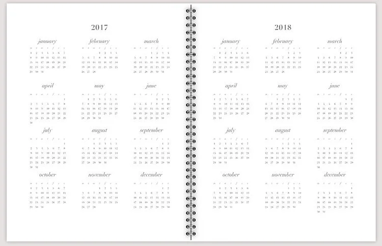
Year
Week Option 1
Month
Week Option 2
Page Layouts
Unlike many planners cluttered with random embellishments in an attempt to appeal to feminine audiences, we take a different approach at The Able Agenda. We question the value of every detail—because, really, does a pretty flower enhance your organization? We think not. Our commitment is to provide ample room for writing, understanding that functionality takes precedence over unnecessary adornments.
Download the designs for personal use at the link below.
Covers
Because the inside of the planner is so clean and simple, the covers are fun and youthful. It's important to appeal to a variety of personality types, thus the diversity throughout the lineup.
Home
Shop
Buy
Customers have the opportunity to choose from either basic or detailed weekly layouts.
Profile
Brand colors are infused throughout The Able Agenda's social media profiles so to help create a unique aesthetic that any brand-aware customer will recognize.
Posts: Brand Voice
Messaging in posts portrays a sense of familiarity, helping to create a relationship with those who cross it's path. Imagery is clean and "cozy" with natural light, as if posted from someone hanging out at home, rather than in a stuffy corporate office.


